GMP / APCOA FLOW
GMP / APCOA FLOW

lead product designer

lead product designer

As the Lead Design Manager, I led a team of three designers working across GetMyParking and APCOA Flow, two major players in smart mobility and parking solutions. GetMyParking focuses on digitizing traditional parking operations, while APCOA Flow is a smart parking management platform for European markets. Our mission was to enhance the experience for users and operators by creating effective internal tools, designing new products, and crafting a robust design system.

Key Contributions

Key Contributions

Key Contributions

Design operations & Building Internal Tools

I managed a team of three designers, ensuring alignment, clarity of goals, and driving creative collaboration.


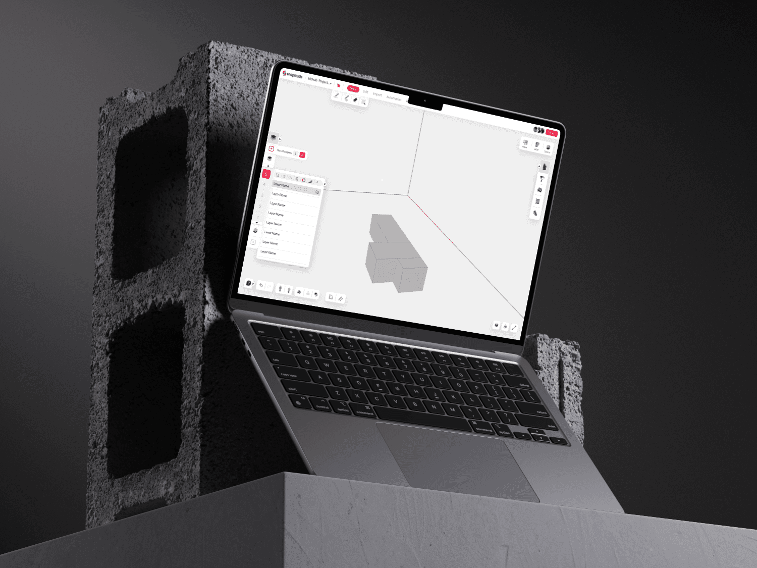
We built multiple internal tools that streamlined operations for parking operators and administrators. This included dashboards for monitoring parking usage, revenue insights, and management of on-ground staff.

It's all about the process

It's all about the process

It's all about the process

Created a toolkit that allowed the design team to effectively communicate design specifications, making handoff to developers seamless and reducing confusion.
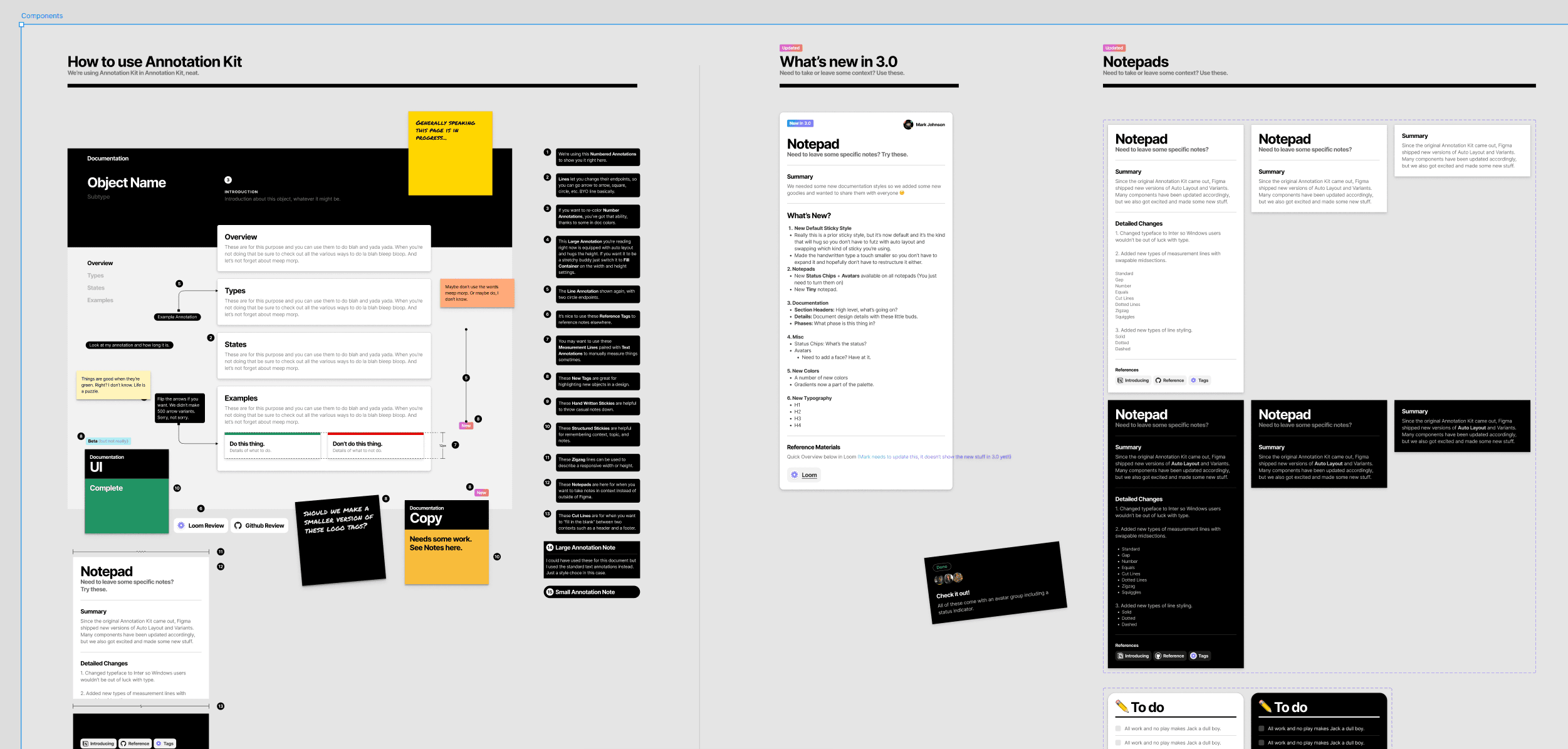
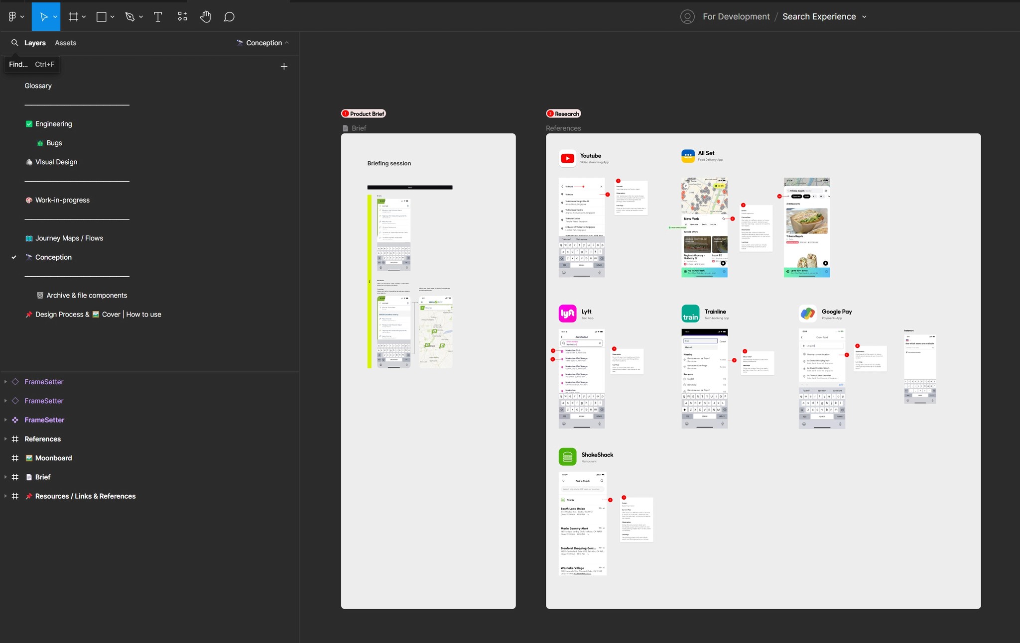
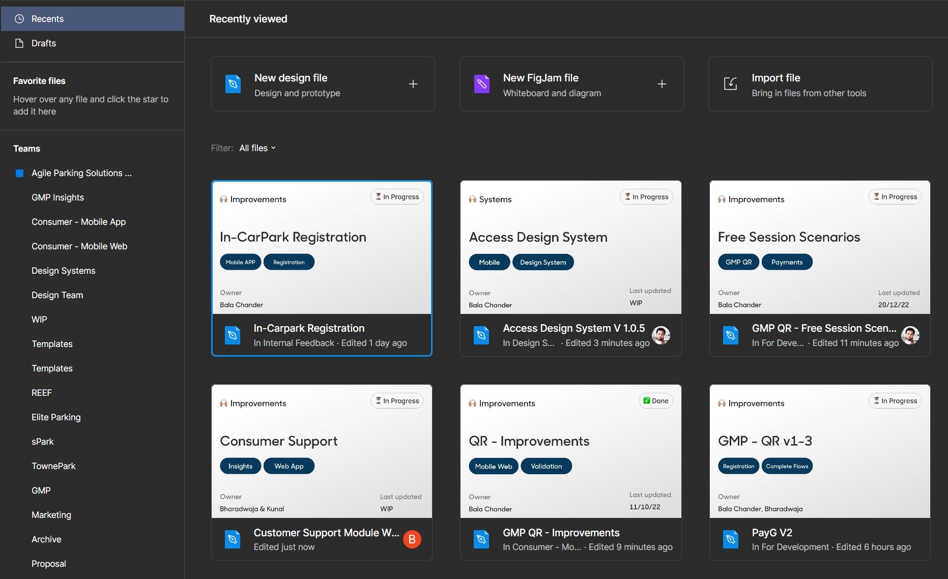
Organising figma

Every document contained a collection of rules, making it simple for both our team members and clients with file access to locate the data they're seeking

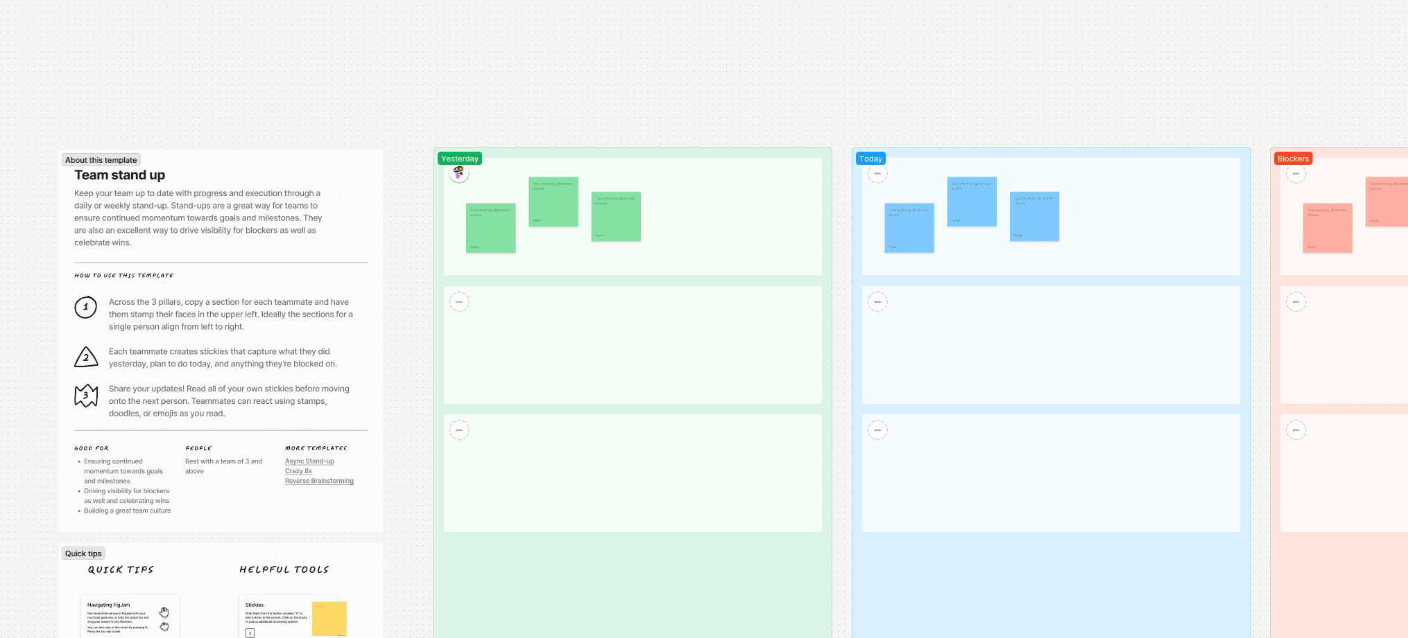
Figjam daily and weekly 1-1 with team to learn and help
Building multiple flagship products

Building multiple flagship products

Building multiple flagship products

Parking Management System

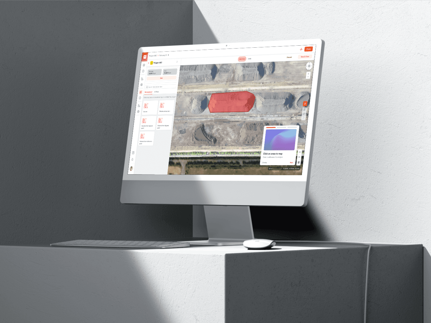
We designed a comprehensive parking management system covering operations, hardware management, tariff engine, pass management, and discounts. This system provided operators with full control over their parking facilities, enabling efficient management of resources.

Parking Management System

We designed a comprehensive parking management system covering operations, hardware management, tariff engine, pass management, and discounts. This system provided operators with full control over their parking facilities, enabling efficient management of resources.

Consumer Mobile App

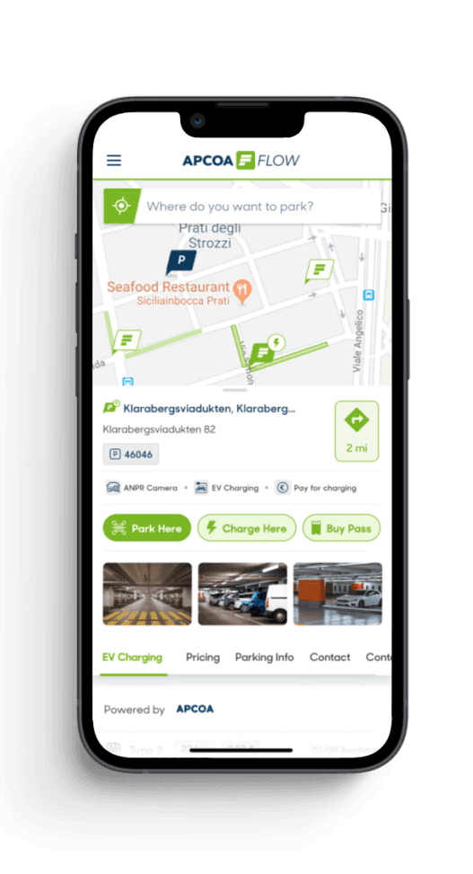
We built a consumer-facing mobile app that enabled users to easily find, book, and pay for parking. The app focused on providing a seamless experience, from discovering parking spaces to making payments and navigating facilities.

Consumer Mobile App

We built a consumer-facing mobile app that enabled users to easily find, book, and pay for parking. The app focused on providing a seamless experience, from discovering parking spaces to making payments and navigating facilities.

QR-Based Parking Product

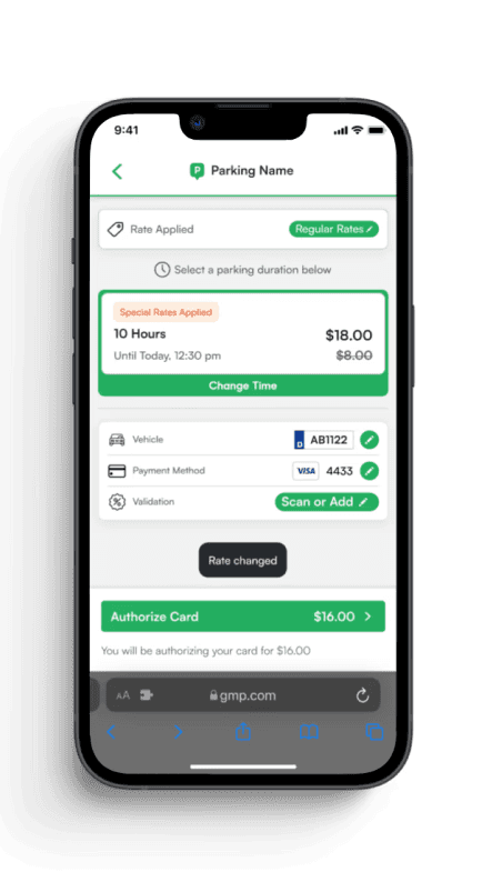
We created a QR-based product that allowed users to scan a QR code at any parking facility to begin their session. This simplified the user journey by offering a quick and contactless way to access parking services.

QR-Based Parking Product

We created a QR-based product that allowed users to scan a QR code at any parking facility to begin their session. This simplified the user journey by offering a quick and contactless way to access parking services.

Users First

Users First

Users First

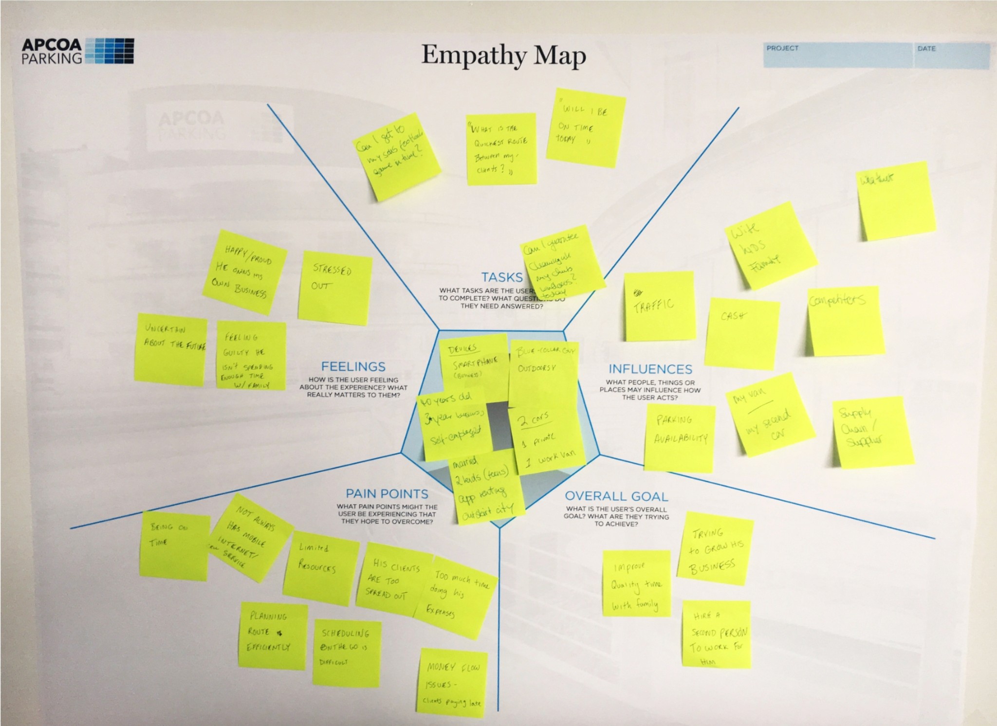
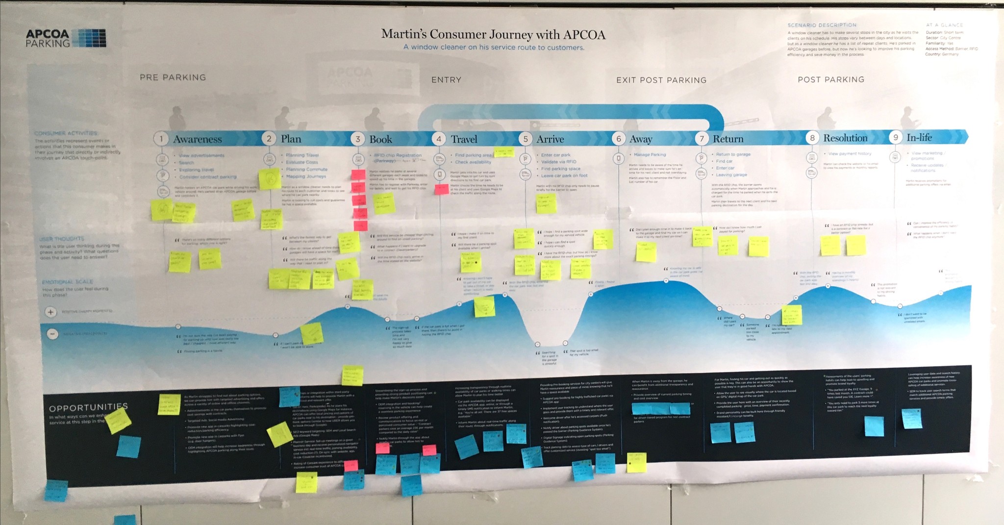
To create a user-centric experience, we performed consumer journey mapping and empathy mapping sessions involving APCOA and internal teams. These exercises helped us deeply understand the needs, motivations, and pain points of both users and operators. Consumer journey mapping allowed us to visualize each step of the user journey, identifying opportunities to improve interactions and reduce friction points. Empathy mapping helped the design team put themselves in the users' shoes, fostering a better understanding of emotional drivers and how our solutions could address real-life issues. This collaborative effort ensured that the design decisions were truly aligned with the users' needs, resulting in more intuitive and satisfying experiences.

Persona: Martin
Martin, one of several personas developed during our research, represents a typical APCOA user—a 38-year-old window cleaner working across multiple city locations. He drives a van, values efficiency due to tight schedules, and relies on parking services to maintain his daily route. His needs include quick, reliable parking solutions, clear communication, and cost-effective options, while his pain points often stem from time constraints and technological barriers. Martin’s persona, alongside others like urban commuters or occasional visitors, helped us ensure our designs cater to diverse user segments within APCOA’s ecosystem.

Key Findings from User Research: Martin’s Consumer Journey with APCOA

The consumer journey map for Martin, a window cleaner on his service route, provides a detailed visualization of his parking experience with APCOA, as seen in the accompanying image. This map, collaboratively developed during our workshops with APCOA and internal teams, breaks down Martin’s journey into nine stages: Pre-Parking, Entry, Exit Post-Parking, and Post-Parking, further divided into Awareness, Plan, Book, Travel, Arrive, Away, Return, Resolution, and In-life.


Research revealed several critical insights into Martin’s experience:

Pain Points: Martin frequently encounters frustration during the "Arrive" and "Book" stages, such as difficulty finding available parking spaces, unclear signage, and delays due to registration processes. Sticky notes on the map, marked in yellow, highlight user thoughts like “I wish I could find parking faster” and “The app crashed when I tried to book,” indicating areas of friction.

Emotional Drivers: The empathy mapping notes, also visible on the map, show Martin’s stress and anxiety when navigating busy city locations, particularly during peak hours. Red sticky notes emphasize moments of frustration, such as long wait times or unexpected fees, while blue notes in the "Opportunities" section suggest potential solutions, like real-time parking availability notifications.

Opportunities for Improvement: The blue sticky notes outline actionable insights, such as simplifying the booking process, enhancing mobile app reliability, and improving communication about parking policies. For instance, during the "Travel" stage, opportunities include providing traffic updates or route optimization to reduce travel time to parking locations.


The wavy blue line across the map visually represents Martin’s emotional journey, dipping during high-stress moments (e.g., finding parking) and peaking when issues are resolved smoothly (e.g., quick exit processes). These insights, captured through collaborative brainstorming and iterative feedback, directly informed our design recommendations to enhance usability and satisfaction.

ONE OF MANY INITIATIVES

Improving Search

Improving Search

Improving Search

Initially, our team focused on meeting market demands by developing products with a business-centric approach. However, as we deepened our understanding of our core principles, we recognized the importance of building a reliable pipeline for delivering high-performance, scalable applications tailored to our customers. This required us to account for the varied linguistic and data requirements of each client. I designed a process and workflow for our design systems that fostered consistency across platforms, significantly enhancing Get My Parking's ability to handle complexity and deliver personalized solutions to our clients.
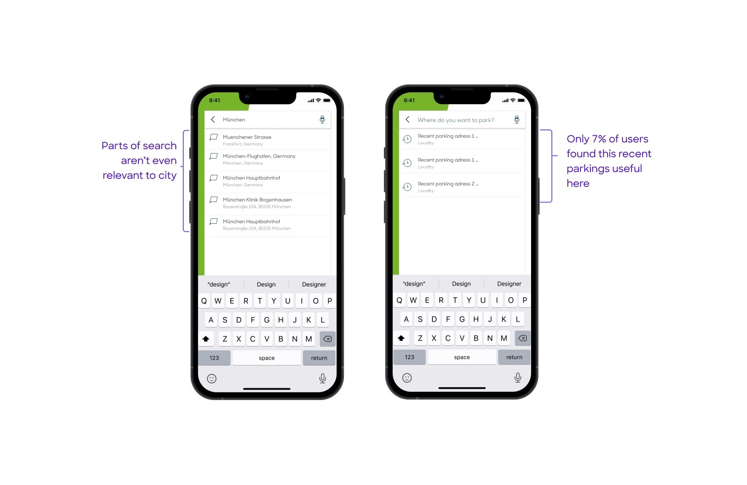
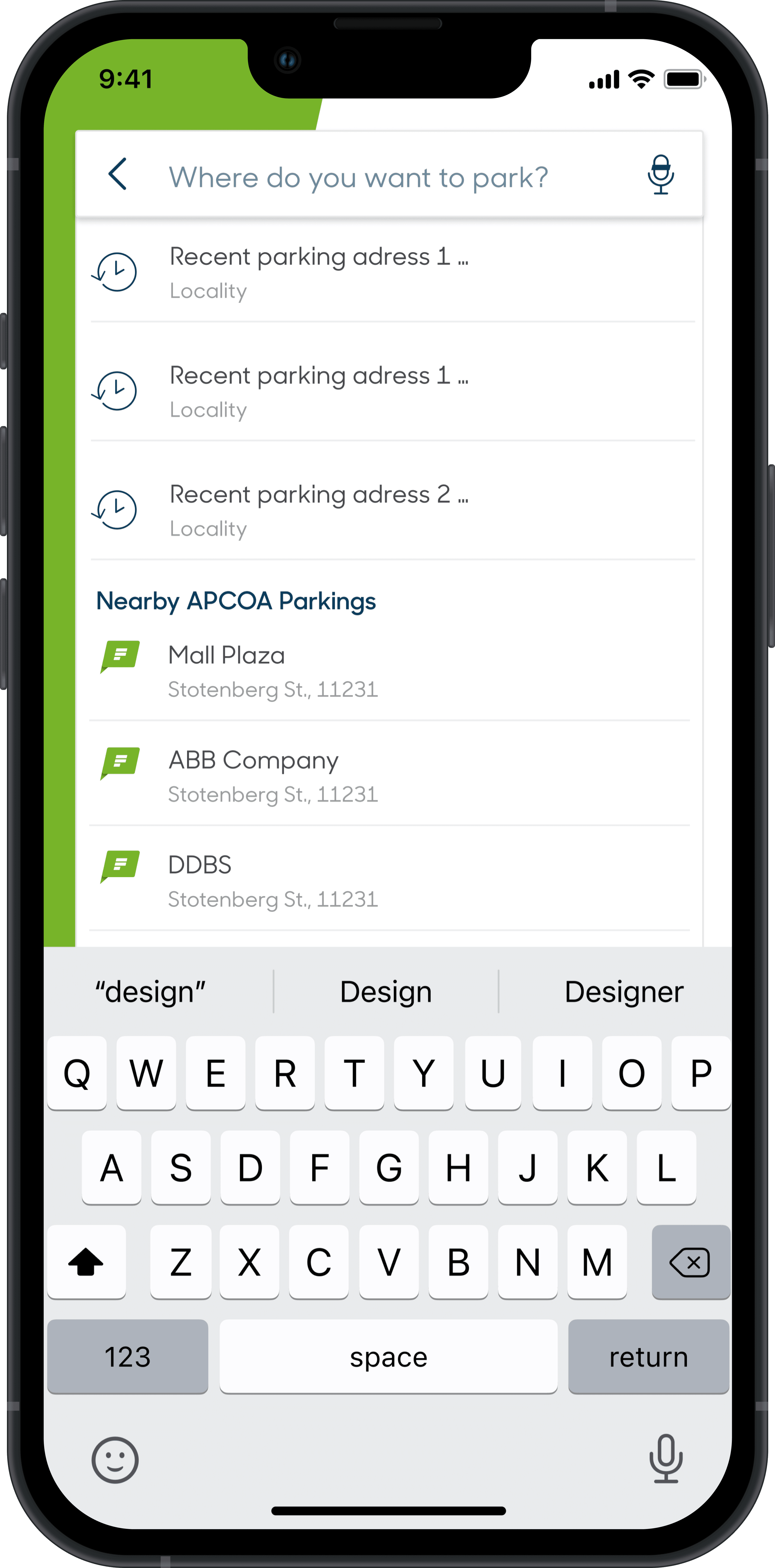
The previous search functionality in our app was challenging to use, especially on mobile devices, where inputting text was cumbersome and results were often disorganized. Our goal is to enhance the search experience by making it faster, more consistent, and context-aware, enabling users to quickly find parking with minimal effort. For instance, when users searched for a city, the results frequently included entries with that city name as a tag, causing confusion, particularly when searching for multiple locations. This issue became more pronounced as APCOA expanded its footprint across Europe, where users were often presented with irrelevant nationwide venues when looking for specific locations.

The previous search functionality in our app was challenging to use, especially on mobile devices, where inputting text was cumbersome and results were often disorganized. Our goal is to enhance the search experience by making it faster, more consistent, and context-aware, enabling users to quickly find parking with minimal effort. For instance, when users searched for a city, the results frequently included entries with that city name as a tag, causing confusion, particularly when searching for multiple locations. This issue became more pronounced as APCOA expanded its footprint across Europe, where users were often presented with irrelevant nationwide venues when looking for specific locations.

Improved search flow

Improved search flow

Learnings & Takeaways
  • The internal tools reduced operational bottlenecks by providing data at a glance, resulting in a 40% reduction in support tickets related to data access for operators.

  • Redesigning APCOA Flow significantly improved the booking success rate, reducing the number of drop-offs by 25%. Users found it easier to navigate and complete their parking reservations.

  • The Access Design System was fully adopted by both teams, cutting down the design-to-development time by 30%, and reducing inconsistencies across various platforms.

  • More Works SEE ALSO